We all just got back into town from the MAINLAND shoot, late Saturday night (except for the local-hire Camden, Maine members of our awesome crew, of course). And…I cant even begin to express how unbelievable and profoundly memorable my experience on this film has been.
I’m so thankful to be a part of this film. It’s going to look so beautiful…even better than this original video (thank you Film & Weather gods!), but even more importantly, it’s rooted in such a well-written narrative that centers around one of the most well-rounded characters I’ve ever gotten to play on film. I really lucked out, guys.
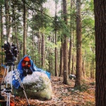
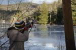
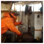
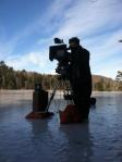
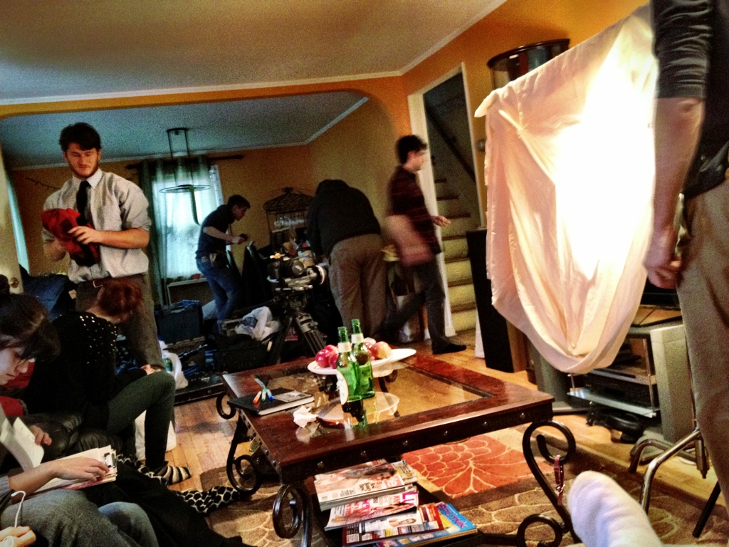
If you’ve seen my Facebook Fanpage anytime these past two weeks, I know you’ve seen just a few of the 14872478926751897 pictures taken throughout the shoot (and those are just the few that I or others took via my Instagram feed). And now, as the all of these awesome pictures begin to pour in from my friends in the crew via Facebook, I just wanted to share a couple of those pics with you now. So here! Take a peak!
Click on one and scroll through them all!
-

- ©2013 Mark Edward Dawson


-

- ©2013 Mark Edward Dawson
-

- ©2013 Mark Edward Dawson

-

- ©2013 Mark Edward Dawson

-

- ©2013 Mark Edward Dawson


-

- ©2013 Mark Edward Dawson
-

- ©2013 Mark Edward Dawson
-

- ©2013 Mark Edward Dawson
-
- ©2013 Mark Edward Dawson
-

- ©2013 Mark Edward Dawson


-
- ©2013 Mark Edward Dawson


-

- ©2013 Mark Edward Dawson

-

- Found these still saran wrapped at a local general store. Just what Jake was looking for!
-

- Aaaand that’s just a little bit of us after shooting was done for the day on one of the longer days. #SorryImNotSorry

")